PROJECT
Pantone 2020

AREA
130 sq. m

YEAR
2019

STYLE
Eco-minimalist

OUR TASK
The customer did not limit us in anything, relying entirely on our taste and style. After a careful study of the lifestyle and habits of all family members, as well as after agreeing on the budget for the project, we got down to work.

WHAT WE’VE DONE
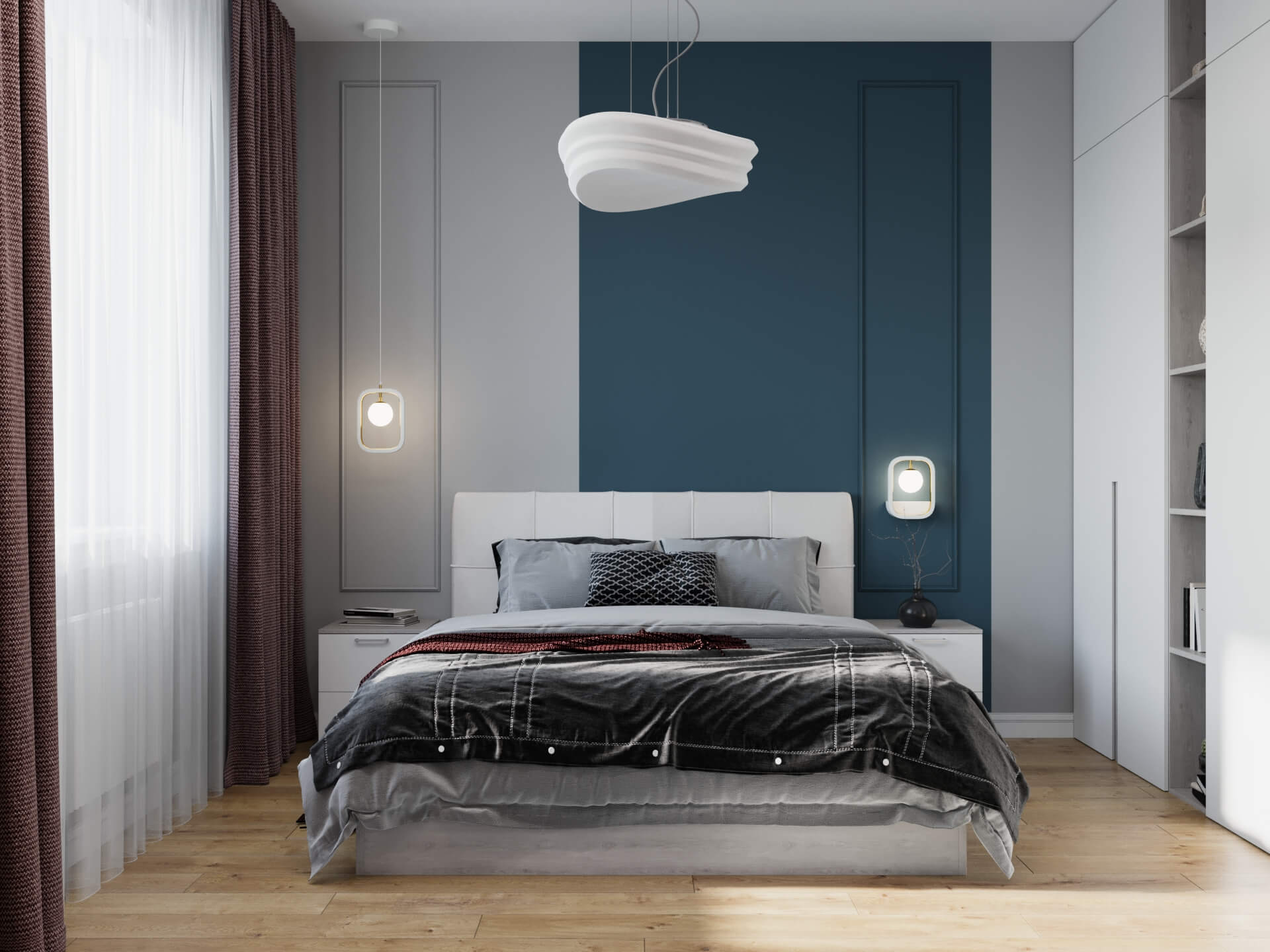
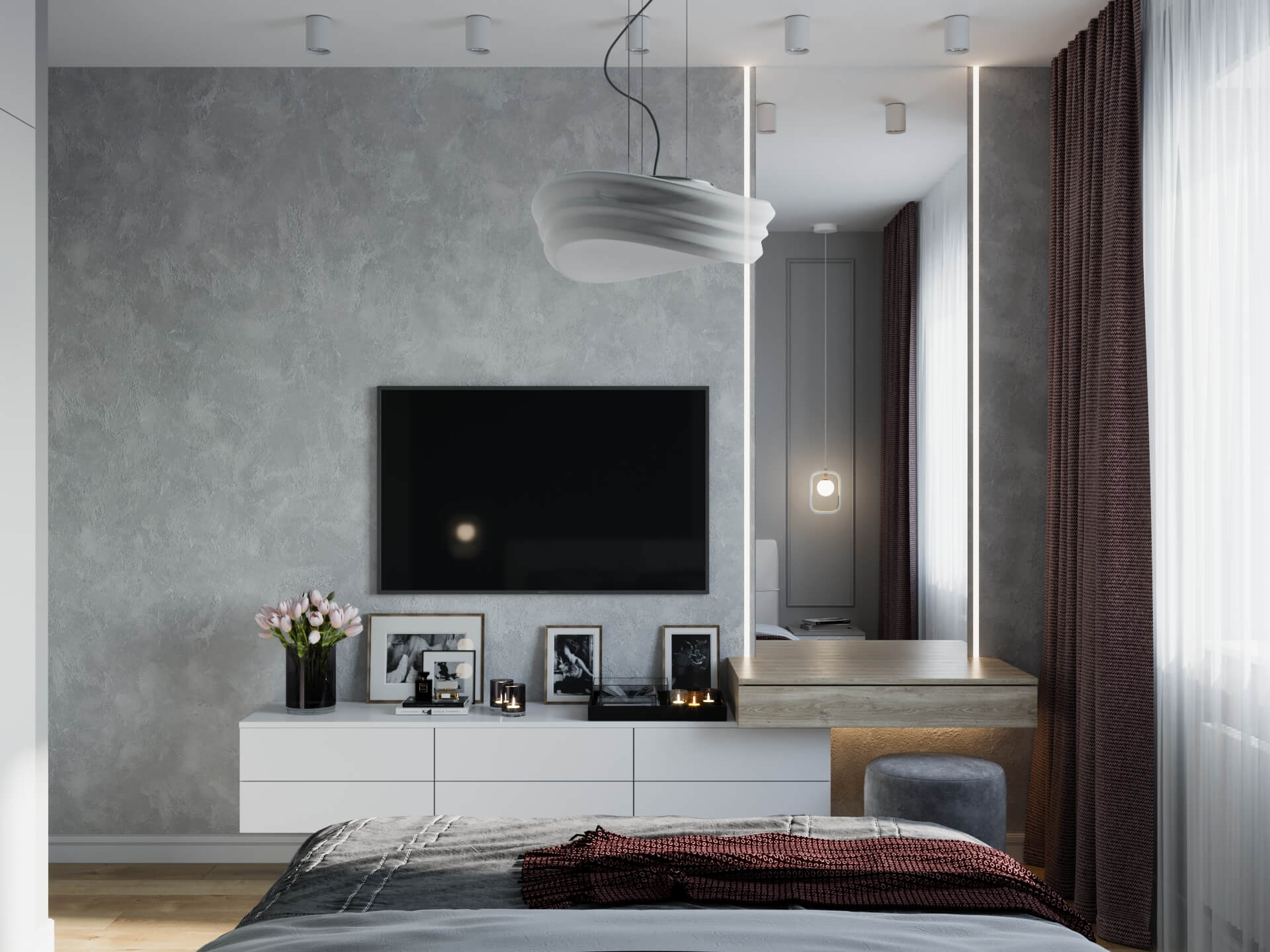
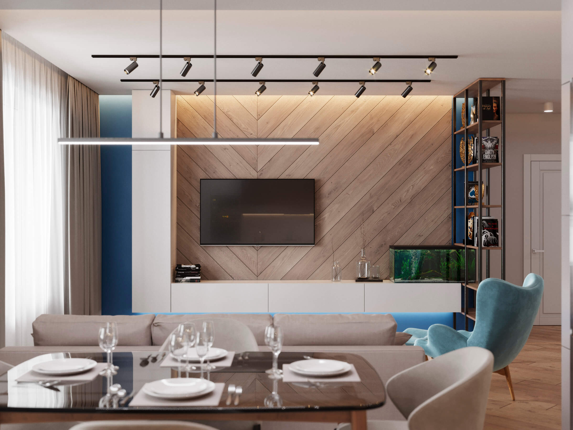
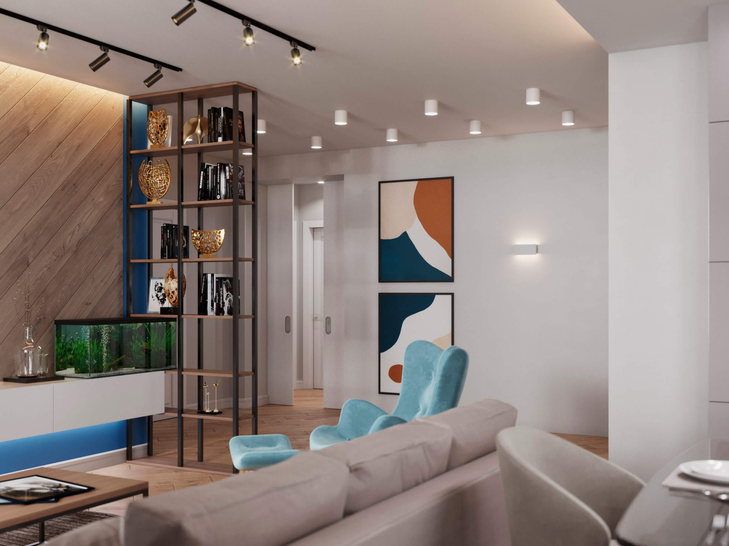
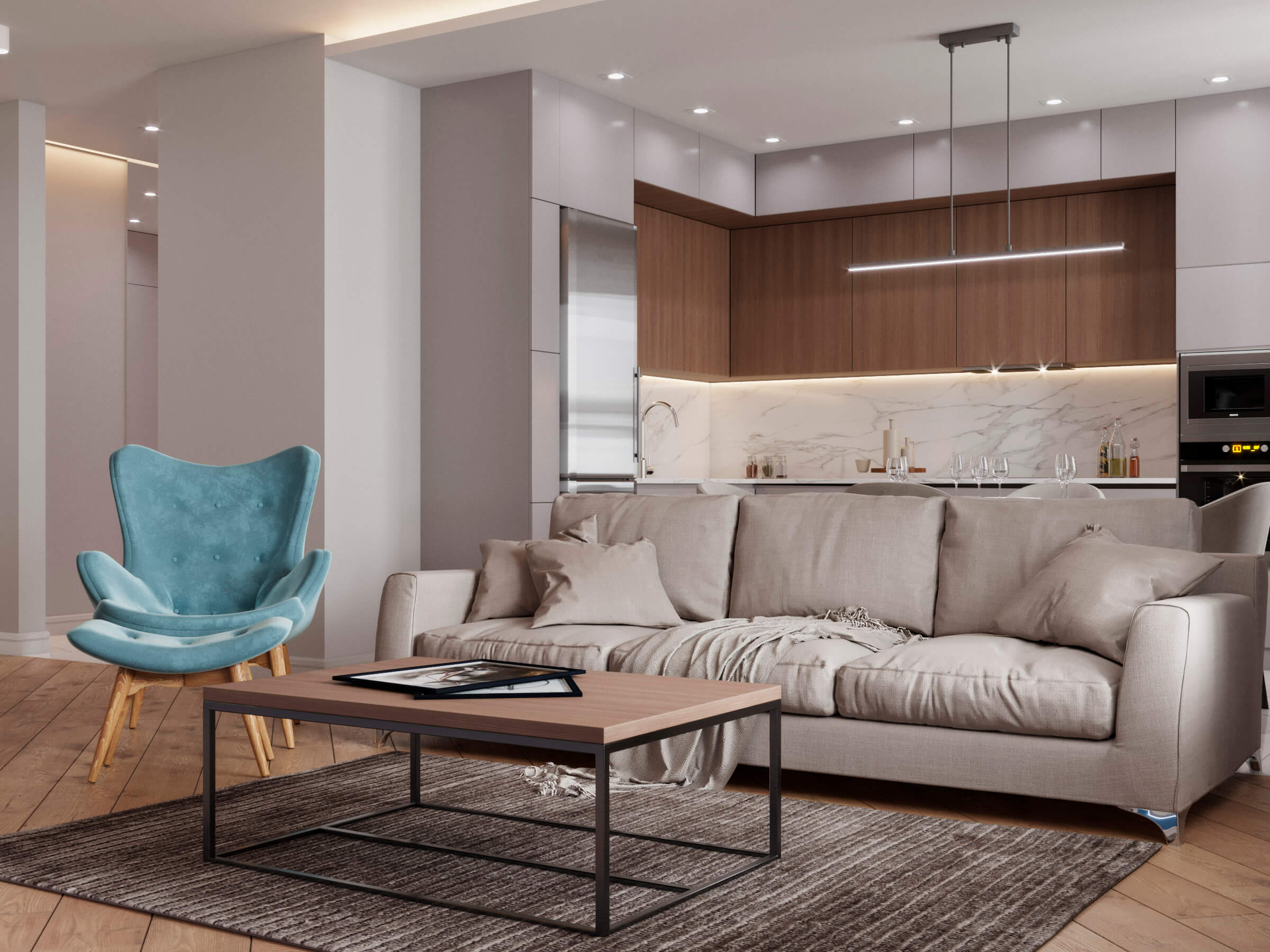
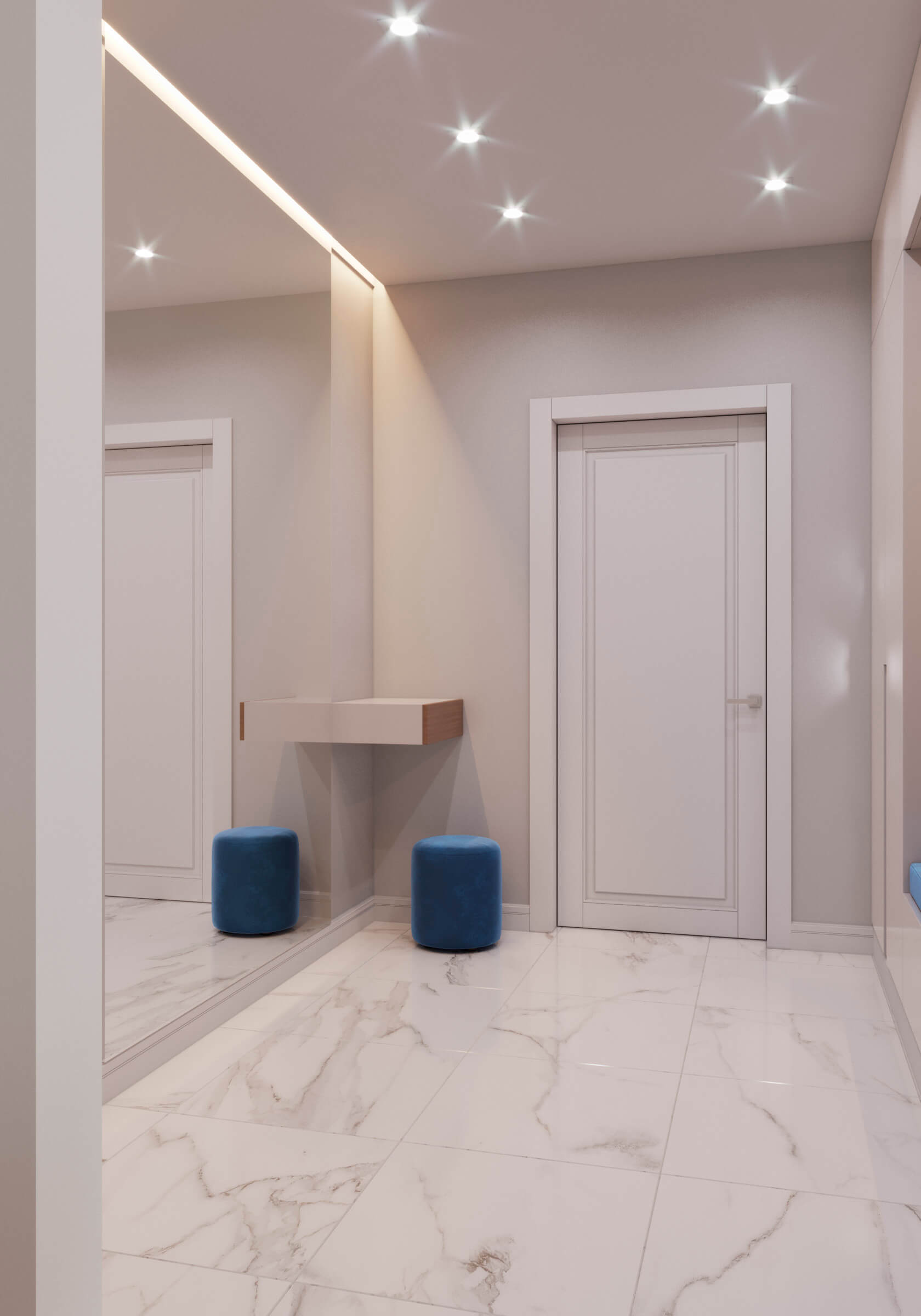
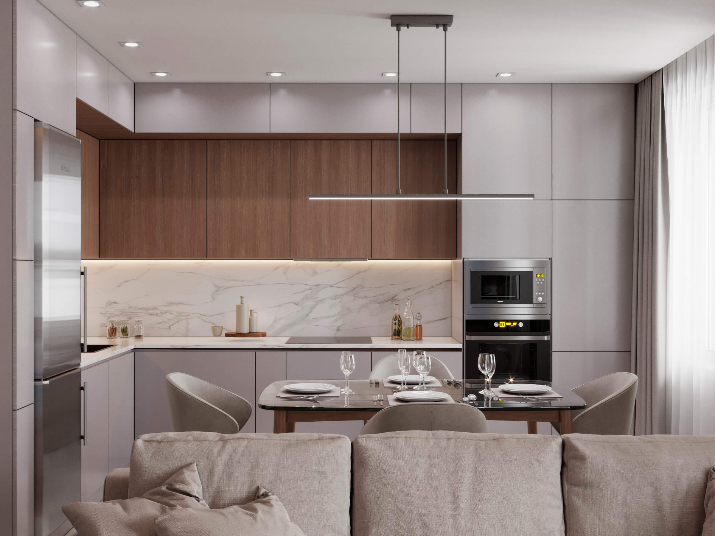
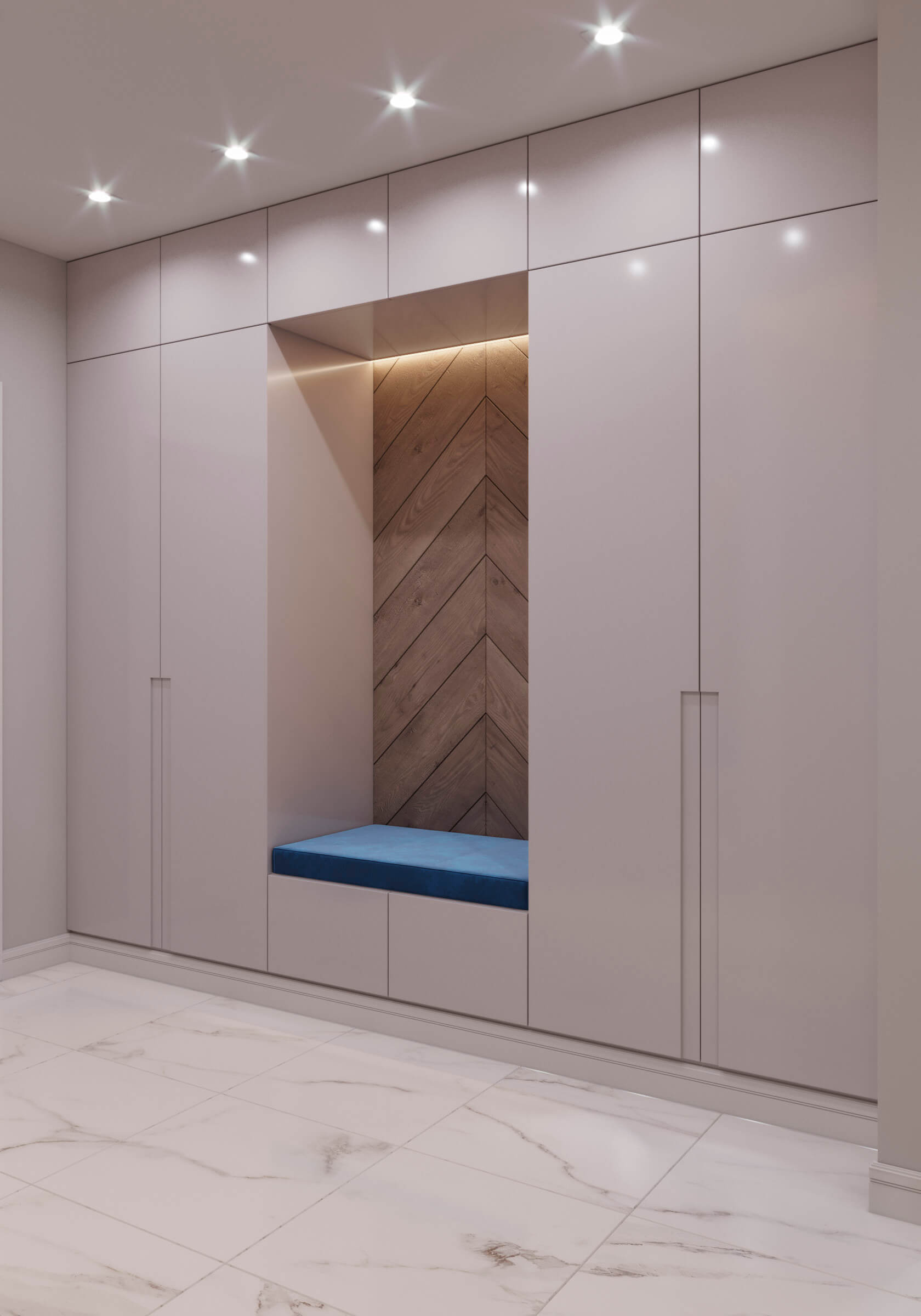
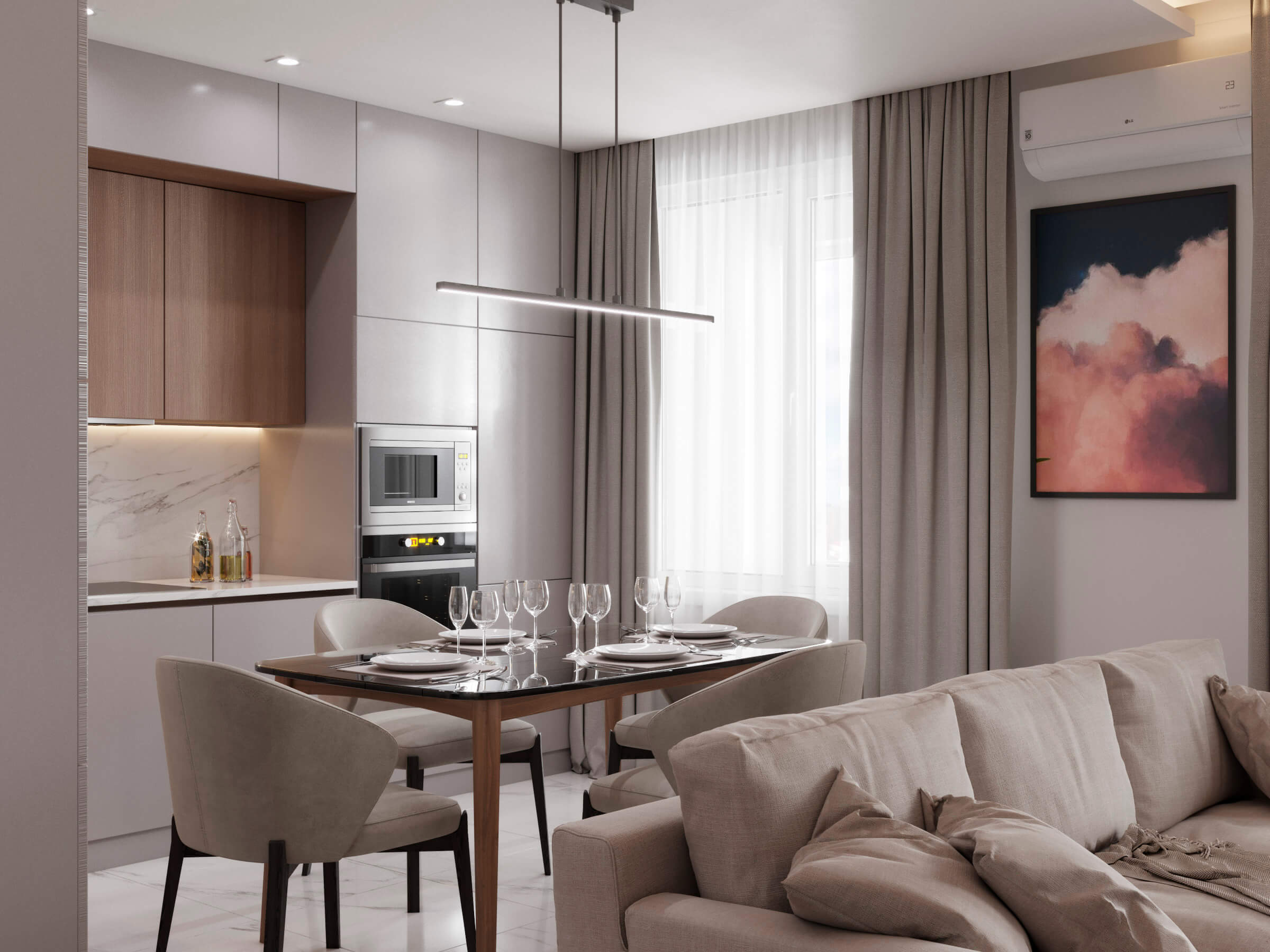
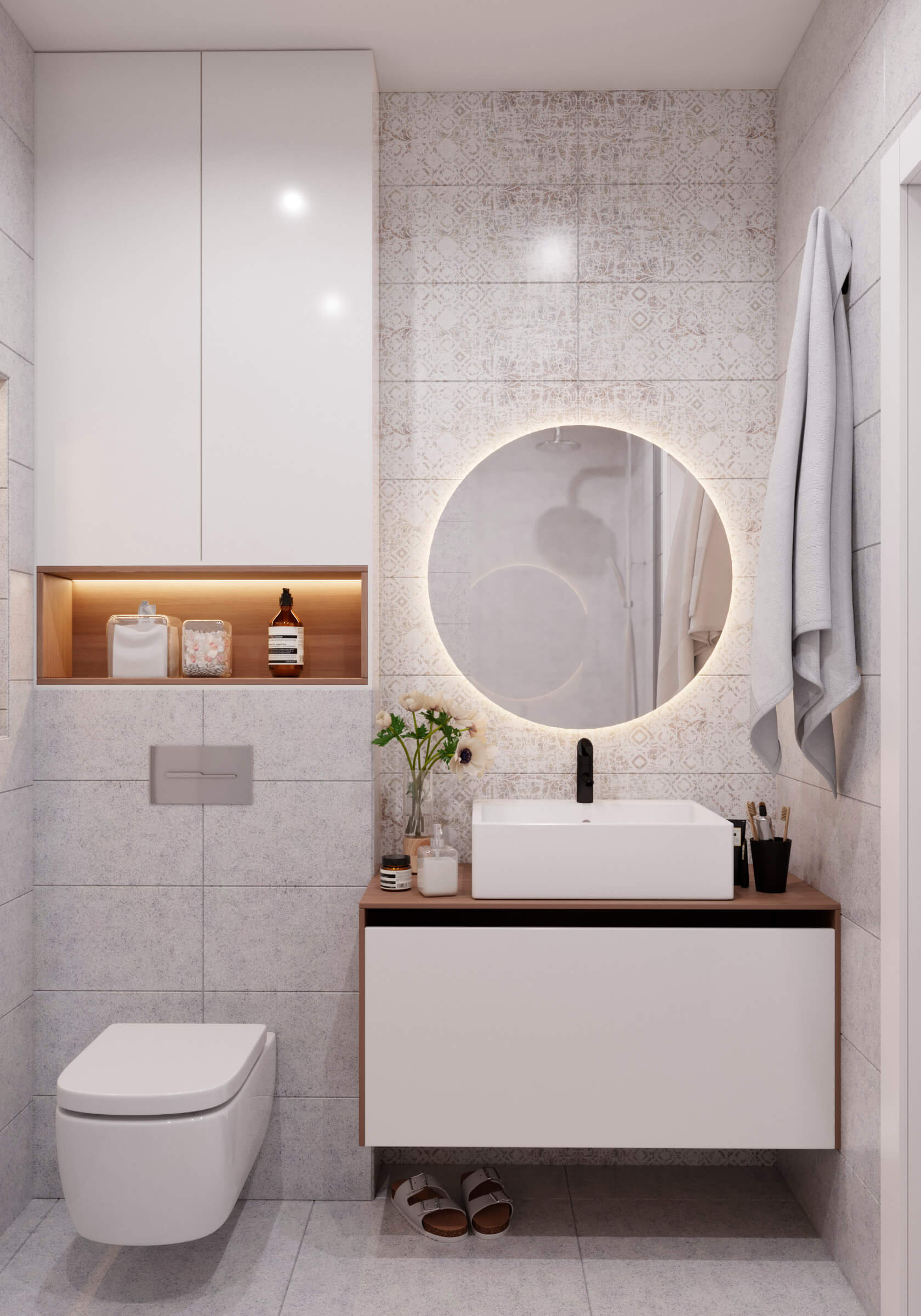
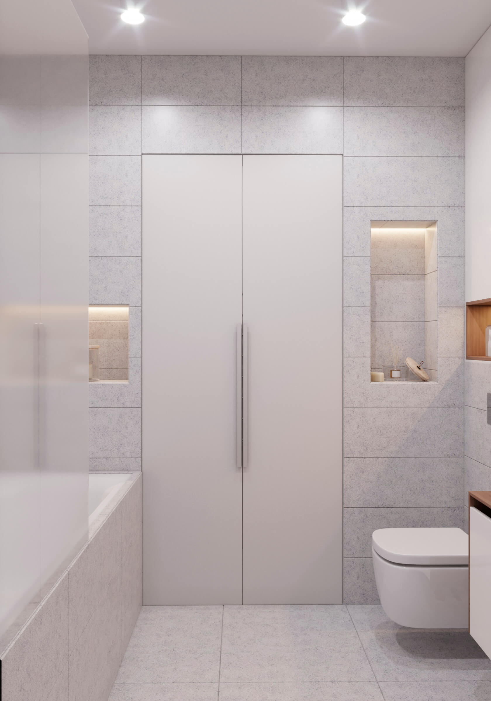
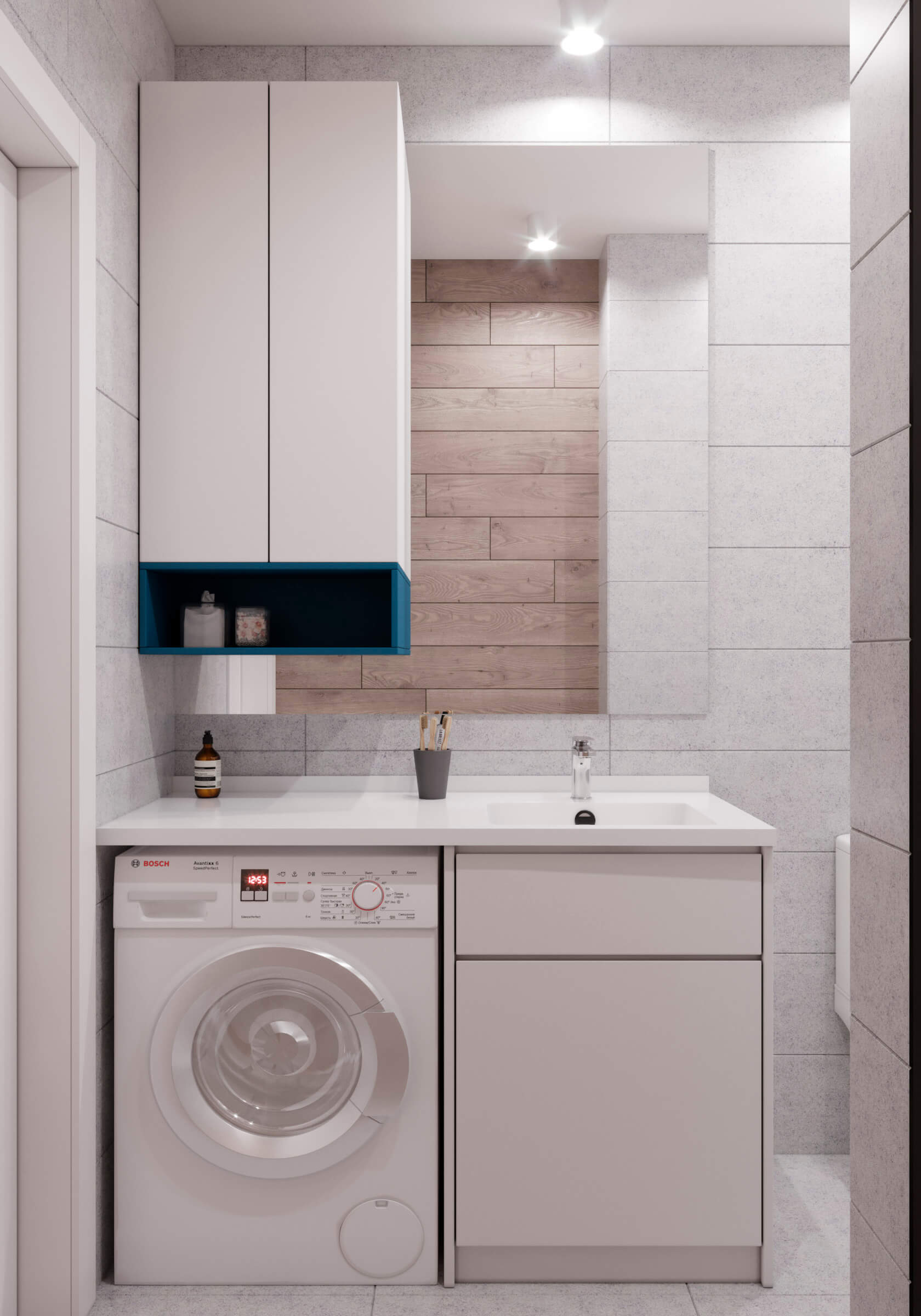
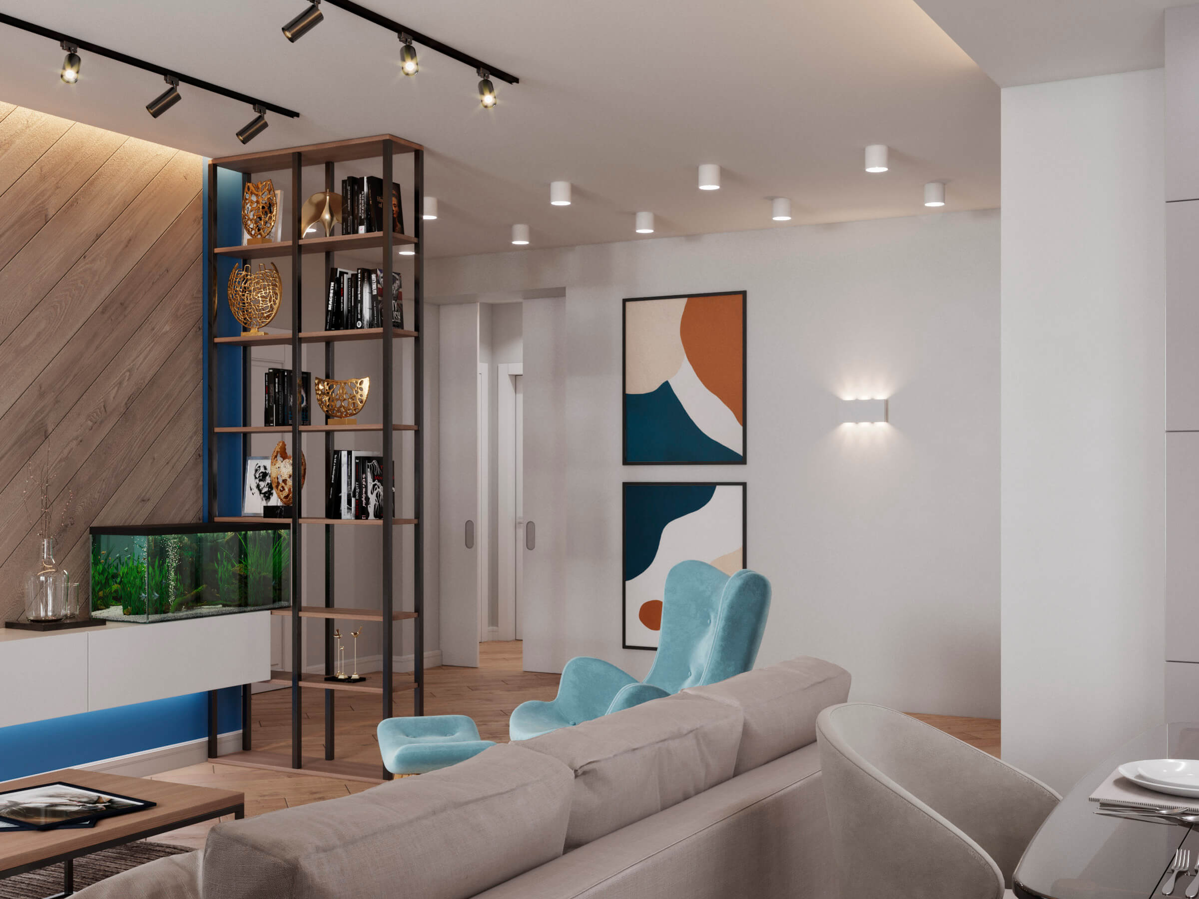
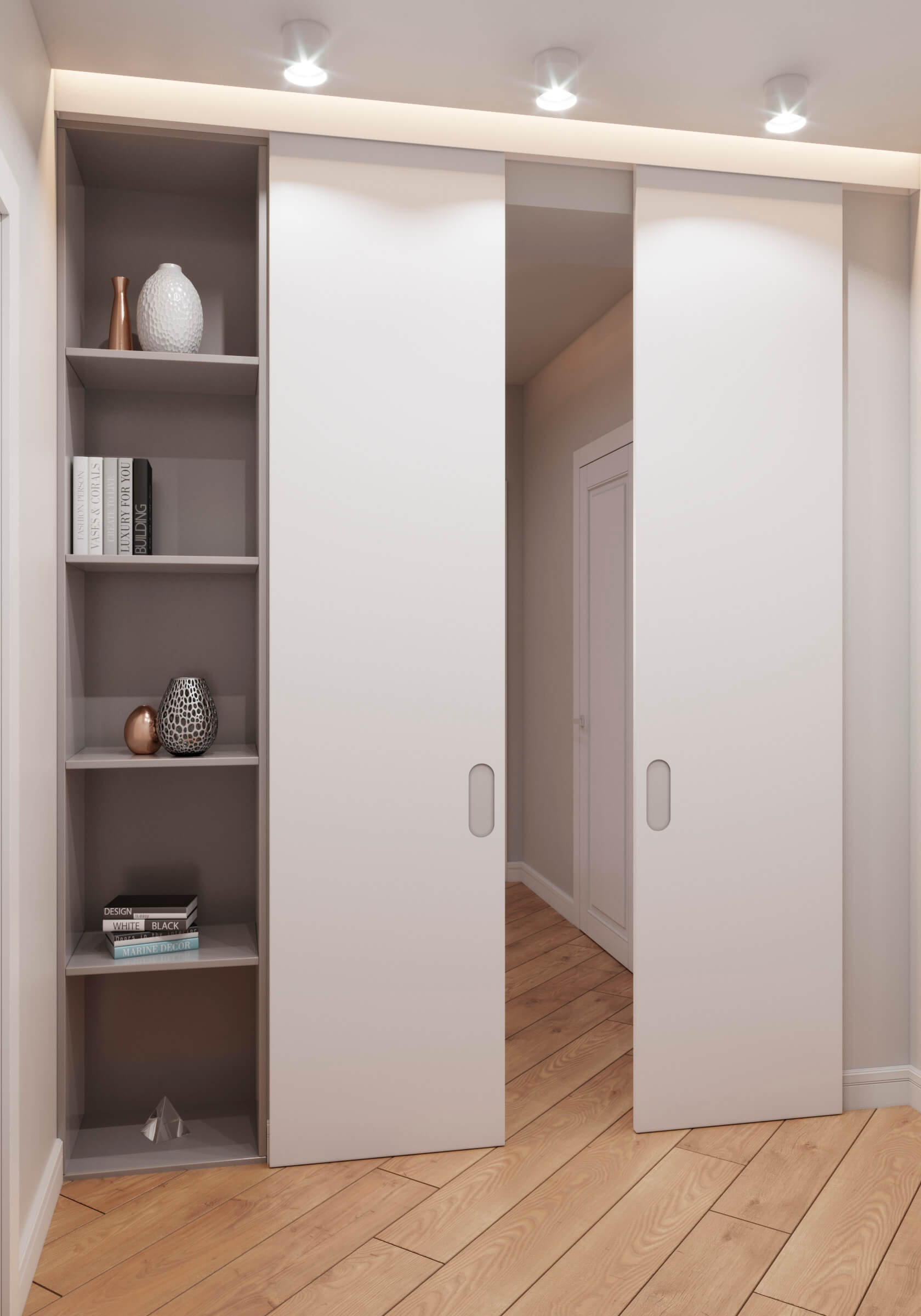
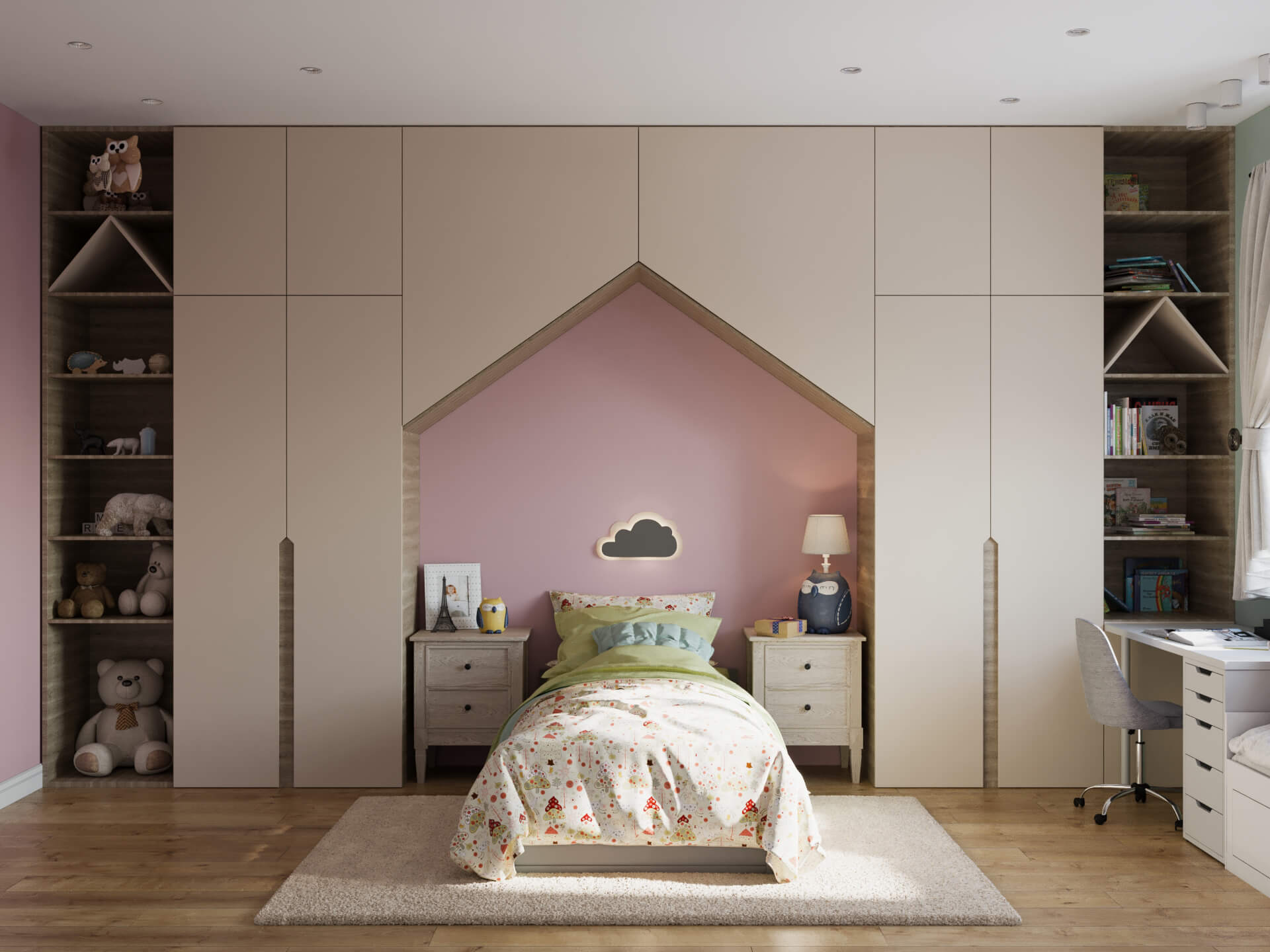
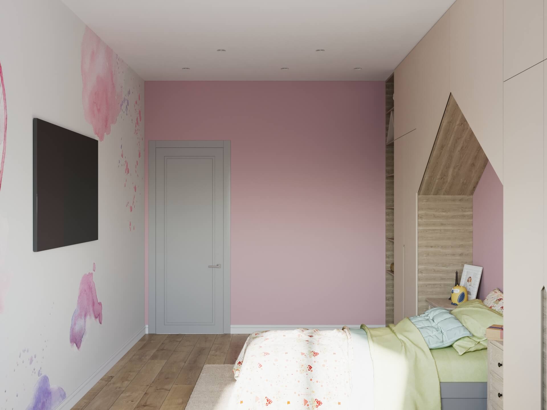
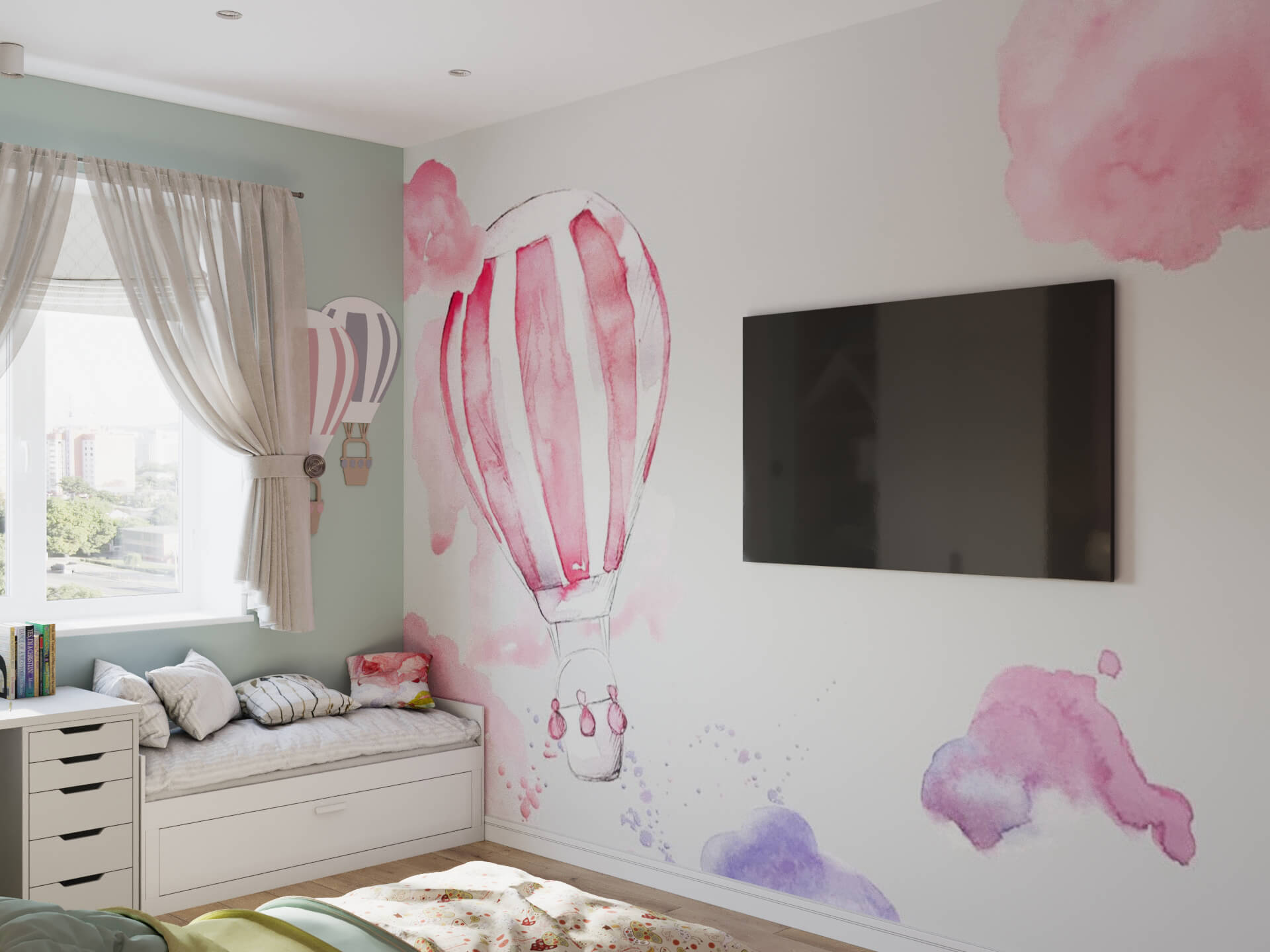
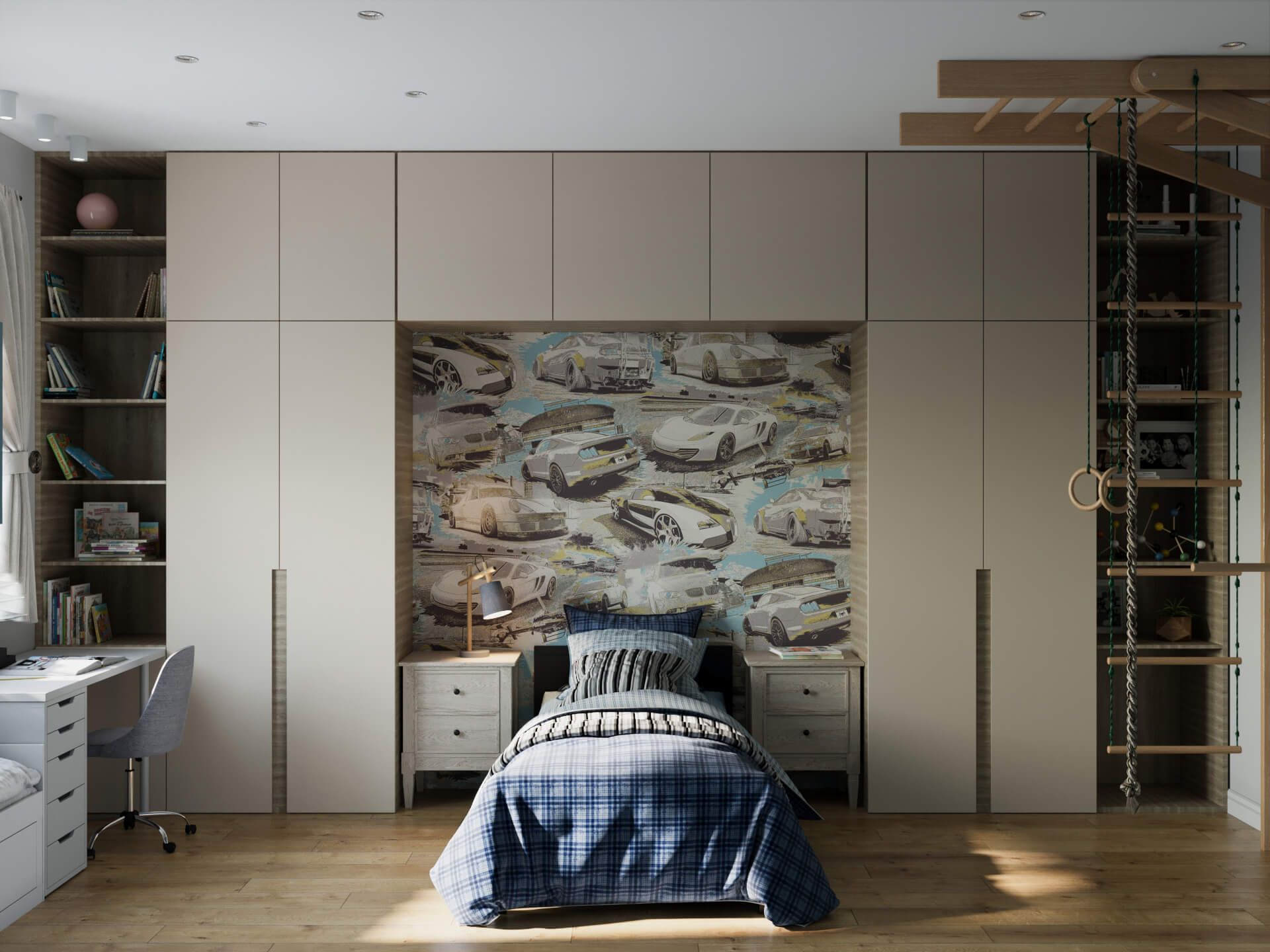
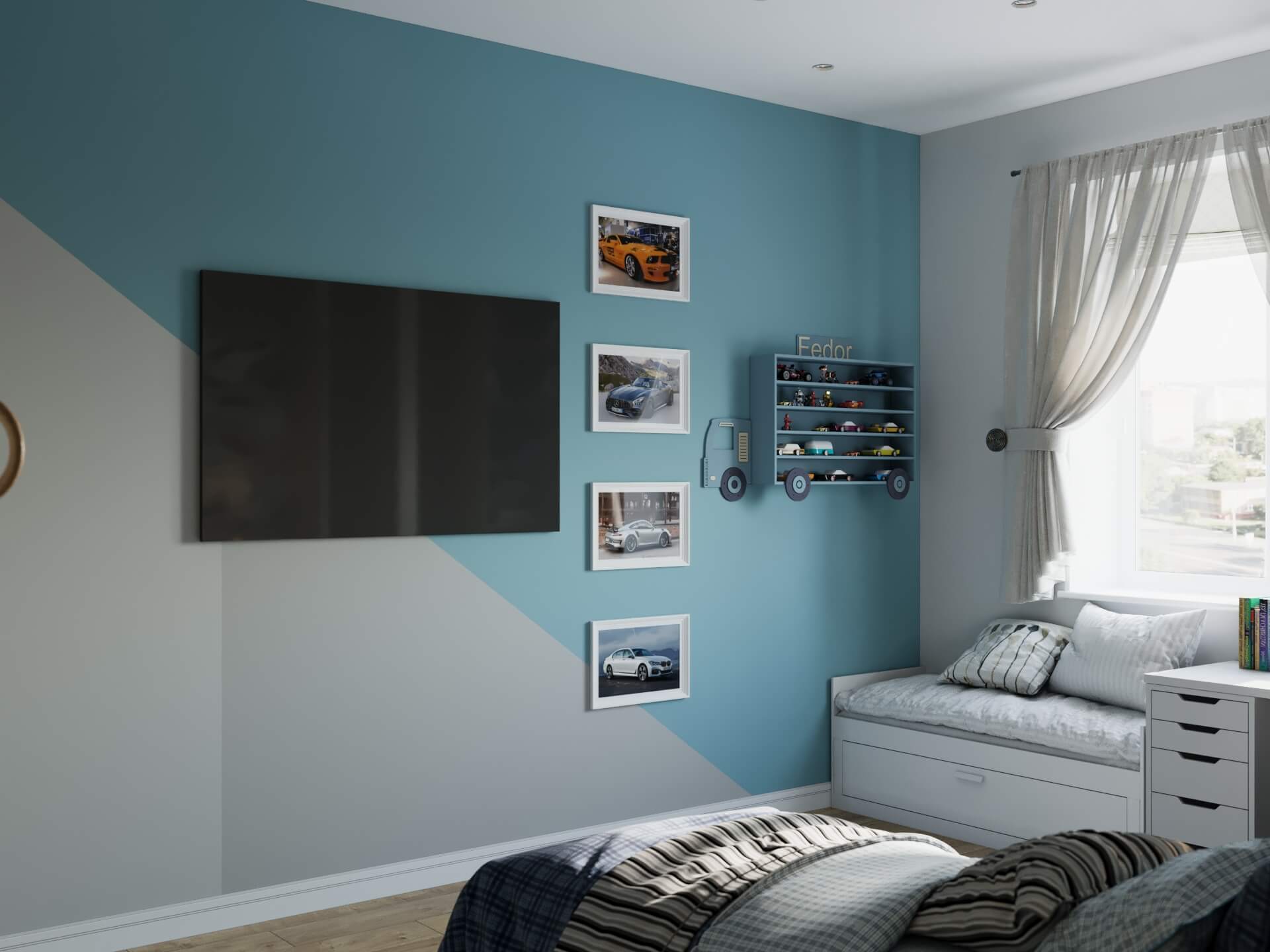
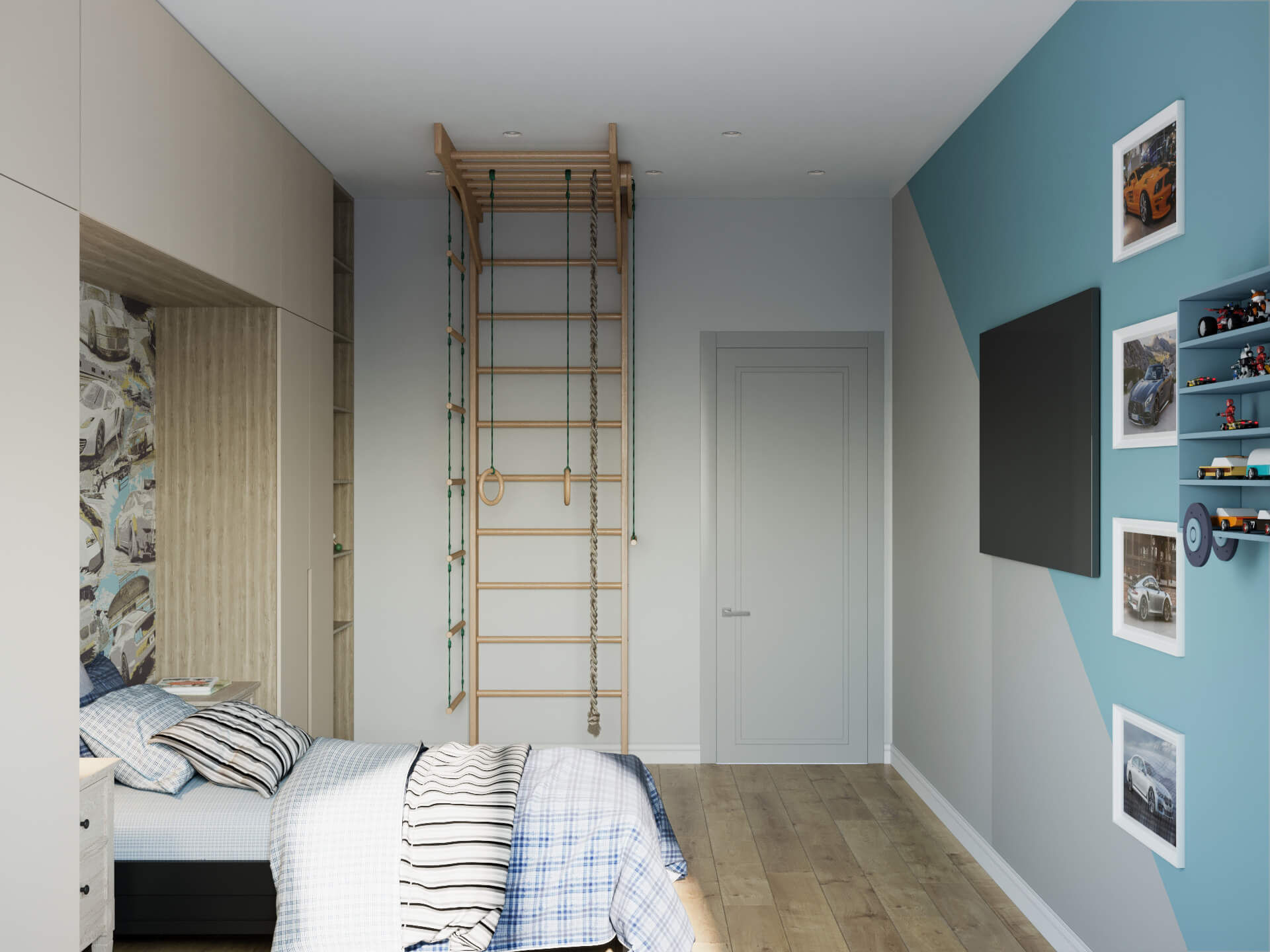
During the design phase of the project, in late 2019, we were surprised to find out that the deep blue color we'd chosen as accent for the apartment had been named the color of 2020 by Pantone. Pantone is an organization that annually picks the color of the year. We realized at that moment that not only do we operate in tune with the times, we can also predict their direction. This apartment is not unlike a gallery, a cozy gallery made for cozy living. It makes one want to flow from one room to the next, admiring the design decisions we made. There are multiple ambient lighting modes for various situations: from work to romantic dinners, with a special quiet area for the children's rooms behind the partition. For each member of the family, we incorporated personal sources of inspiration. We also didn't overlook the children and their needs and developed a unique wall painting design for the girl's room. By the way, the wood panels on the living room walls, laid out in the form of the letter V, were placed there intentionally. Since the family name starts with V, we opted to add a familial touch to this project.
LIKE ANY SOLUTIONS FOR THIS PROJECT?
Please fill the form and we’ll get in touch to discuss your future project.

© 2020 All rights reserved. Design by Artem Getmann
